Harry Beck’s map
A draughtsman, out of work, drew a map that the world copied.
How this site works. Every fact is in our own words and linked to its source, beside it. Where good sources disagree, we show each version in a “Sources differ” box.
Before Beck
The first maps showing the whole Underground were produced in 1908, as posters and folding pocket maps, with colour-coded lines over a simplified street map. LT Museum, Beck
A map like a circuit
Harry Beck, a draughtsman for the Underground, designed a new kind of map in his spare time in 1931. LT Museum, Tube map
Beck had worked as a draughtsman for the Underground since 1924, and drew the map during a spell out of work in 1931. LT Museum, Beck
He used only horizontal, vertical and 45-degree lines, enlarged the crowded centre and squeezed the outer ends. LT Museum, Beck
The map gave up geographical accuracy so that passengers could understand the network more quickly. LT Museum, Tube map
Beck made station names bigger and swapped round ‘blobs’ for the now-familiar ‘ticks’. LT Museum, Tube map
Rejected, then a hit
At first the Underground’s publicity department rejected it as too revolutionary. LT Museum, Tube map
The first pocket map was printed in January 1933, with a note asking users for their comments. LT Museum, Beck
Maps were usually printed 10,000 to 20,000 at a time, but the first print run of Beck’s map was 750,000. LT Museum, Beck
Frank Pick called it ‘very convenient and tidy’ and ‘a better map than any we have had so far’. LT Museum, Beck
It was an immediate success with passengers. LT Museum, Tube map
Keeping it up to date
In 1935 the Bakerloo and Central lines, red and orange and hard to tell apart under artificial light, were changed to brown and red. LT Museum, Tube map
Beck thought his 1950 map was his finest; it was the first to show the Circle line separately. LT Museum, Tube map
The name ‘Circle line’ first appeared on a poster in 1936, and the line got its own line on the Tube map in 1949. TfL
In 1960 Beck was replaced as the map’s designer without being told, and was deeply hurt. LT Museum, Beck
Harry Beck died in September 1974. LT Museum, Beck
A design classic
Since 2001 every Underground map has carried a credit saying it is an evolution of Beck’s 1931 design. LT Museum, Beck
In 2006 the map was voted the second-favourite British design of the 20th century. LT Museum, Beck
Other cities’ railways, including New York, Sydney and St Petersburg, have borrowed Beck’s idea. LT Museum, Tube map
Beck even drew a proposal for the Paris Métro, which was not used. LT Museum, Tube map
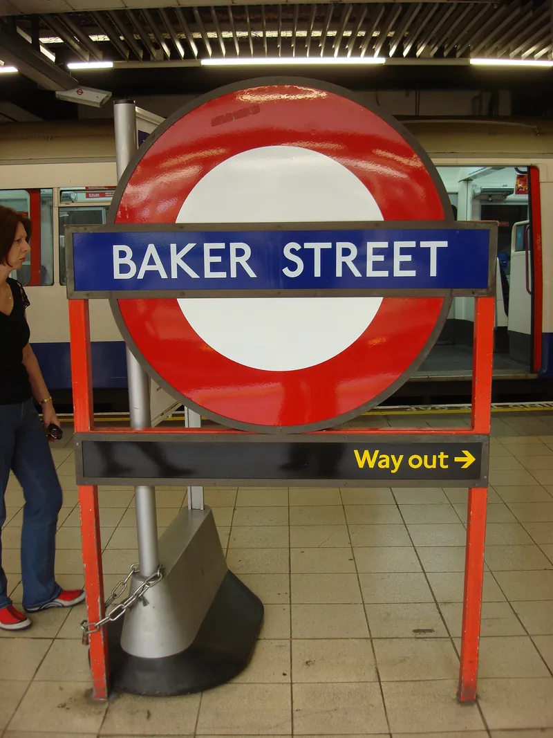
We have not shown Beck’s own map here, because it is still in copyright. The London Transport Museum’s pages, linked in the sources, show it.
Our view: Beck’s map works because it is honest about what passengers need: which line, which way, where to change. It gave up the real geography and nobody minded.
Next: the roundel →