A red disc, a blue bar and some very good letters
How the Underground got one of the world’s best-known signs.
How this site works. Every fact is in our own words and linked to its source, beside it. Where good sources disagree, we show each version in a “Sources differ” box.
1908: a red disc
The roundel first appeared on station platforms in 1908, as a solid red disc with a blue bar across it, used as a station name board. LT Museum, roundel
It made the station’s name stand out from the advertisements around it. LT Museum, roundel
Frank Pick and Edward Johnston
In 1915 the Underground’s publicity manager, Frank Pick, asked the calligrapher Edward Johnston to design a typeface for the company. LT Museum, roundel
Pick’s aim was to raise fare income by making the Underground better publicised, its stations easier to spot and the system easier to use. LT Museum, Johnston
Edward Johnston was born to Scottish parents in Uruguay, and his family moved to England when he was three. LT Museum, Johnston
In 1906 he published the influential book Writing & Illuminating & Lettering. LT Museum, Johnston
Johnston sent Pick the first examples of his capital block letters in February 1916. LT Museum, Johnston
The Johnston typeface is a sans serif: its letters have no small strokes, or serifs, at their ends. LT Museum, Johnston
The bullseye
By 1917 the roundel had been redrawn to suit the new lettering: the solid disc became a ring, and it was registered as a trademark. LT Museum, roundel
Johnston called it the ‘bullseye’. LT Museum, roundel
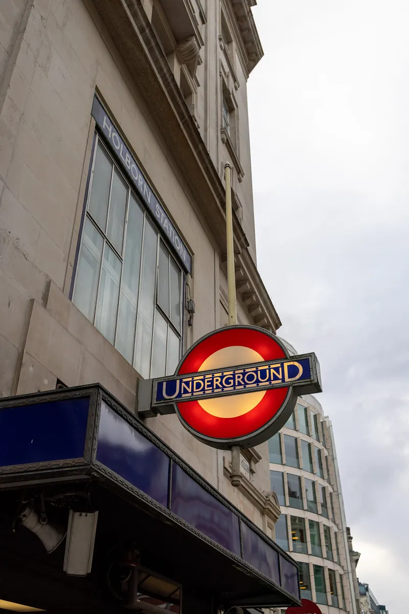
Stations to match
From 1924 Pick asked the architect Charles Holden to design new stations, and Holden built the roundel into them, on masts outside and in stained-glass windows. LT Museum, roundel
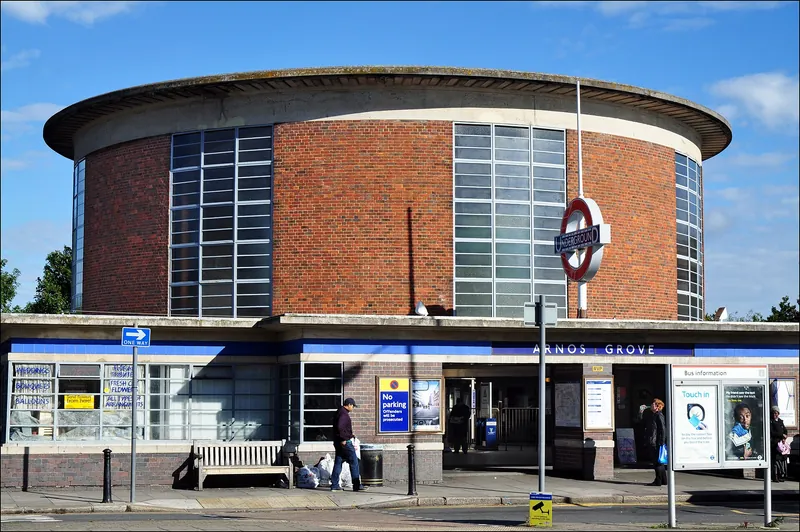
Still in use
In 1979 Eiichi Kono, a young Japanese designer, revised Johnston’s letters and added bold and italic versions. LT Museum, Johnston
Monotype’s update, Johnston100, has been rolled out by TfL since 2016. LT Museum, Johnston
Transport for London, created on 3 July 2000, uses a family of roundels in different colours for its different services. LT Museum, roundel
The roundel is now one of the most recognised and copied logos in the world. LT Museum, roundel
Next: wartime →